

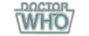
the Peter Davidson years
Again, started with Baker 1, but still the one recognized as Davidson’s logo. They went with the “neon” look, which certainly gets your attention. I could see that as a neon sign in some fan’s flat. I wonder if anyone actually made one? Marvel US switched to this logo when they started reprinting Davidson’s comics. I think it’s pretty cool.


