

And finally….
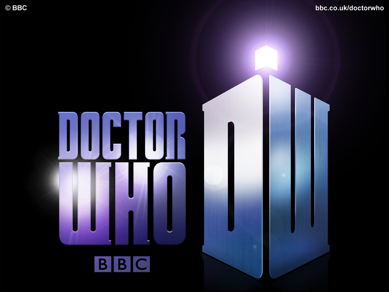
…for the reason we’re all here. The brand spanking new logo Steven Moffat has laid upon the world for Doctor Who. I think it’s pretty cool, going a bit retro, but borrowing from a few different logos, mostly the first and current classic logos. The Police Box shaped “DW” logo would look good on merchandising, but otherwise I’m not sure it’s all that necessary. Even if it also looks pretty cool. I’m mostly curious to see how it all works within a new opening sequence.


