Batman & Robin #1
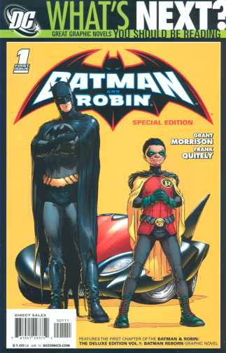
(this is the special $1.00 reprint as part of DC’s post Watchmen promotion.
DC Comics (June 2010 reprint)
WRITER: Grant Morrison ARTIST: Frank Quitely COLORIST: Alex Sinclair LETTERER: Patrick Brosseau ASSISTANT EDITOR: Jamelle Siegel EDITOR: Mike Marts COVERS: Frank Quitely & J.G. Jones (no idea which one did this cover or if it was a team effort)By now anyone that cares to read this story already has, so I’m not really sure what I can add to it. This comic was, of course, the fulfilling of Silver Age prophecy.

The only picture I have of Batman 2 and Robin 2 is from the Captain America Elseworlds crossover
Of course, by “retired” he means dead bouncing around the timestream, and “Bruce Wayne, Jr.” would rather go by Damien and thinks of himself as BATMAN’s son, not Bruce’s. He’s also a brat, but he does have his strong points, as a character if nothing else.
The new Batmobile (perhaps a precursor to the Batman Beyond Batmobile, since that series has been dragged into DCU continuity…somehow) is pretty cool in theory and in practice, but in design, I don’t know. It’s not really all that scary, really, and not as impressive as some of my favorite Batmobile designs. It doesn’t suck, but it doesn’t really shine, either.
While it seems like this would be a good arc for the new team, I pretty much stand by my decision to not pick up this series. I still found the “Mr. Pyg” part disturbing, especially in light of Stephanie’s torture time back and in hindsight after Liam Nelson being blown up. Maybe if someone saved the young girl, but as it stands I doubt that happened. I just have too many issues with the current state of the DCU to really get into this comic.
That may be a shame, as I hear a lot of great things about Morrison’s run. It ends up being further proof that events elsewhere in the DC Universe proper have just turned me off to the mainstream books as a whole. On the other hand, I can easily understand why Morrision gets the praise he does. On the art side, Frank Quietly does indeed to a good job. Either he or the letter deserves praise for this part especially.

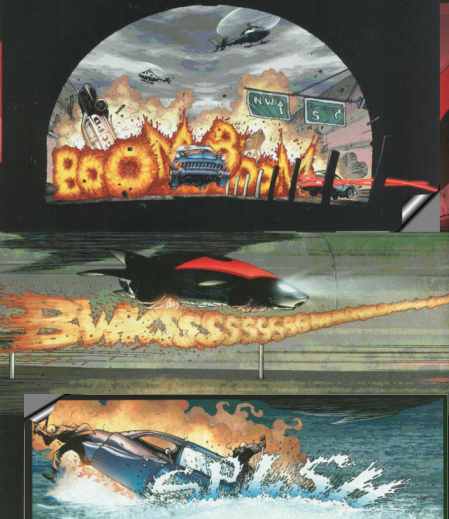
The way they worked the lettering from the sound effects into the artwork in these three panels was rather inspired, and pretty neat. I like the comic overall, but I’m just too bitter towards the DCU to pick up the series myself. That doesn’t mean it doesn’t deserve the fan support it has, and I rather wish that Morrison was the go-to guy at DC instead of Johns.
Tomorrow’s Comic> Doctor Who Classics series 3 #5


