Every now and then I bring up logos, from DC’s recent failures to Doctor Who through the years–which has been getting quite a few hits lately. Are they changing the Who logo again? That’s because I really like a good logo. I also like making them. Sometimes I think I start a new article series just to create a new logo.
I also recently updated the logo for this site, but I’ve been wanting to make a few more. Recently I decided to make two particular logos I wanted to have for a while now as well as complete a series of images for my blip page (as of this writing I’m waiting on them to post the darn things) and I thought I would share them here.
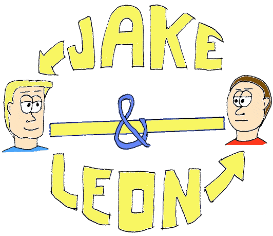
The first one is for the Jake & Leon archives, and for the regular article archives, rather than using the strip as the “featured image”. I’ve actually had this one in thumbnail stage for months and in my head for slightly longer. Now at last it is complete!

Although I’m wondering if I shouldn’t have made it a bit smaller. For some reason I thought the circular design was the way to go, with arrows pointing to which character is which. Since at least one of them shows up in every comic I didn’t want to have to have someone mention him by name every time for new readers to know who is whom.

When I put this into the editor I thought this was going to be too big as well, but when I checked the preview it actually looks fine, since the comic is behind the jump. This will look OK on the homepage; just start with the set-up paragraph(s), pop in the logo, hit the “more” tag, and there you go. It’s just Captain PSA’s symbol with “Captain” at the top but I don’t think it need anything else. It’s a silly PSA parody set in a comic book/cartoon universe. It doesn’t call for a lot.
The next two are banners I set up for my Blip page and hopefully they’ll be up someday so you can see how they look. (Plus it will make the video site look better.) Blip has certain requirements for size of each type of promo image so that will affect how they look below.

I designed the header image with a similar design to this site’s header (unless I’ve changed either by the time you read this in the future). Only instead of Jake and Leon (to promote the comic) I drew myself. The original design had the BW logo sitting atop a brick wall and I intended to have spotlights shining up, with a cityscape behind it. Yes, like the 20th Century Fox logo.

20th Century Fox logo used from 1953 to 1987 created for the new CinemaScope process with the slanted “0” (Photo credit: Wikipedia)
As I worked on it, however, I decided to drop the stack and use a background similar to the one I use for the header. I also tried to play with shading a bit. How did that work? I also threw in a mention of Video Game Clutter although I would like to make a separate site for The Clutter Reports at some point.

On the odd chance that someone wants to recommend the Spotlight page on their Blip page (they haven’t set up that ability for me just yet), you have to have a “poster” image, kind of like a movie poster but with no credits. I went for the comic book look, using some of my favorite fictions. Transformers, Doctor Who, and Godzilla being my three favorites meant breaking them out. I decided to give Scooter the fourth spot because of the positive GoBot reviews, and that design was before the Challenge of the GoBots review hit 500+ views. I think that’s the most popular review I’ve done on both Blip and YouTube. Either they wanted to see a thrashing or some people actually wanted to see a positive review.
Godzilla is often depicted in US media as being green but his color actually is supposed to be grey. I kind of split the difference and went for a greenish grey. Otherwise, I could still do better when it comes to drawing but I do design a good poster, I think.
I’m happy with my results and I think that’s what matter at this stage. There really wasn’t a point to this article except to show off. 🙂


