
I checked. The three covers formed one tapestry.
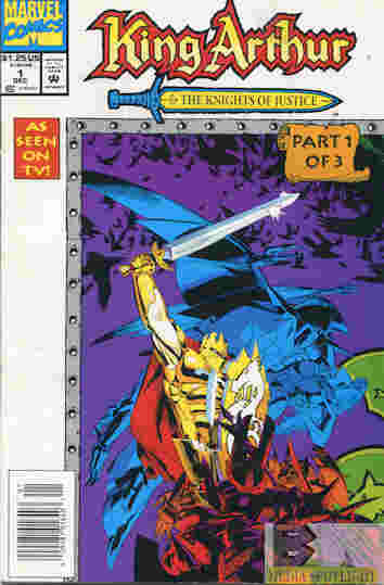
King Arthur And The Knights Of Justice #1
Marvel (December, 1993)
“Opposites Attract” WRITER: Mike Lackey PENCILER: Keith Wilson INKER: Evelyn Stein COLORIST: Rene Witterstaetter LETTERER: Dave Sharpe EDITOR: Tom DeFalco
Based on the animated series, Merlin is the sole defender of Camelot against Morgana’s magical stone warriors, led by lone human Viper. When Blackwing (he’s not a relative of mine) is able to get past his Merlin’s defenses and kidnaps Lady Guinevere. With the Knights Of The Round Table already captured, the Lady Of The Table tells Merlin to summon warriors from the future. Now Camelot’s last hope is a modern-day college football team, the Knights, led by Arthur King.
What they got right: For the most part, and I haven’t watched the show in a long time mind you, it’s a good adaptation. The artwork invokes the style of the show rather than the Marvel house style. (And this was before the house style went to crap.) Each Knight gets a peek into their personality, even ones who barely did anything in the show. It does a good job of setting up the concept.
What they got wrong: But not a great job, if memory serves correctly this is only have of “The Opening Kickoff”, the first episode, while the first story arc was three episodes long, and this is a three issue miniseries. For the room given, I’m worried too much was packed into the last two issues, but I don’t have them to find out.
Recommendation: As decent as the comic looks, the whole series (both seasons) is available for relatively cheap and you might be better off doing that instead of hunting down the comics.


