
“Three claws? Well, my gun can shoot three bullets at once!”
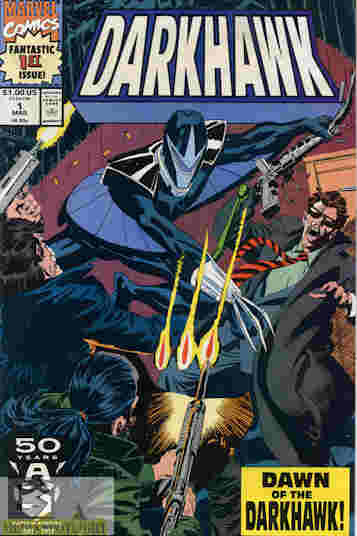
Darkhawk #1
Marvel (March, 1991)
“Dawn Of The Darkhawk” WRITER: Danny Fingeroth ARTIST: Mike Manley COLORIST: Joe Rosas LETTERER: Joe Rosen EDITOR: Howard Mackie “DARKHAWK” CREATORS: Tom DeFalco & Mike Manley
Chris Powell’s life isn’t easy at the moment. His mom, a DA, is being threatened by agents of her current target, Philippe Bazin, putting stress on her but also making her more determined to put him away. When his brothers sneak off to the abandoned amusement park, Chris follows and they see their dad, a cop who always talked about getting a edge on crime, apparently taking a bribe. When the trio are spotted dad takes off but the bad guys follow the boys, until Chris finds a strange amulet that gives him an armored body that he can use to save himself and his brothers. Using the name a strange drunk gave him, Chris decides to use this armored body to become that edge, but his new prize is also being sought by Bazin…and Hobgoblin!
What they got right: I love the Darkhawk design. The armor is something the 90s actually got right. It certainly represents the era but is cool like a superhero costume/armor should be. Even the shoulderpads are good for the look. This is another attempt to represent the Spider-Man formula, only with a troubled family instead of bullies and a dead uncle. It doesn’t give away the entire mystery of what’s going on, but unlike many 90s comics gives you enough to care and to only be as confused as the main character.
What they got wrong: The 90s art style is beginning the slow infection however. They gave Chris a mullet, for Pete’s sake. The coloring is darker. Although it could be worse…and probably will.
Recommendation: Darkhawk is my second favorite Marvel hero (after Iron Man) and I wish I had the whole series. If you want a second opinion, my pal CFerra reviewed it on Comic Showcase but I recommend it. Also, check out my interview with Danny Fingeroth about the comic.


