

Before anyone starts: no, I cannot judge the quality of the movie based on a teaser image. I am not going to do so. I am judging the teaser image itself and whether or not it succeeds at its job–getting me interested in the movie and giving me some hope that James Gunn understands what he’s doing when it comes to Superman.
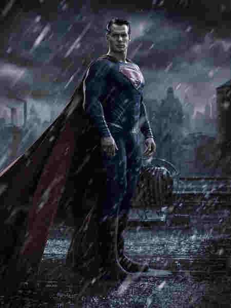
However, the recent reveal of the Superman costume, with a teaser image of David Corensweat in presumably the final outfit, is just the trappings. You can get the outfit right and still get the character wrong. That said, the Superman outfit is rather important. It reflects the character’s personality and presentation. For example, the outfit Richard Donner gave Christopher Reeve for his role as the Man Of Steel is bright and hopeful, while the outfit Zack Snyder gave Henry Cavill for his role in Man Of Steel…kept him from being naked. The cape was too long, the colors too dark, the material itself was that same basketball covering used in The Amazing Spider-Man movies for Peter, and the S symbol was wrong. It’s not like there weren’t tons of other outfits in live-action, animation, and the original comics to point the costumer to and say “make this to fit Henry”, and the same is still true for David.
The outfit, as I pad out the intro for the homepage, can best be described as an improvement over Snyder’s outfit. It’s not terrible, but as you’ll see a few…adjustments had to be made. So I popped the image being circulated on X-Twitter by Discussing Film into the ol’ image editor, make some tweaks, and while I’m sure by the time this goes live better image editors have already improved on it, what I did wasn’t too bad for my skill level. I’m satisfied with it, but first we should go over the good and bad of the teaser image. It almost works. Almost.

click for larger size in a new tab
Like I said, it’s an improvement over the Snyder suit.
And yet it suffers from some of the same issues, namely the two biggest ones. The colors are too muted, though Gunn’s is slightly lighter. Slightly. In a livestream of Professor Geek going over the outfit a commenter named Elfrunner mentioned it looks more like the “evil Superman” outfit from Superman III and he has a point, as a bunch of people thought it looked dirty. Snyder messed with the S shield a bit and it doesn’t quite work, but as we already knew, Gunn is going for a “Kryptonian hieroglyph” idea that isn’t what the S was originally. However, despite what one writer tried to claim last week and I had to counter, resembling an S instead of a backwards L is what led to him being called “Superman” in more recent depictions, so it HAS to look like an S. As I went over in that article, it’s also how the shield evolved, starting out as an S created by either Clark or his parents. The Donner film was the first time it was depicted as a family crest, which continued with Supergirl, Smallville used the S to create a symbol for Clark which in that timeline would allegedly lead to the S on his outfit, and was a symbol on the device Clark’s parents recorded their farewell message onto in Superman: The Animated Series, possibly also still a family crest or in comics of the period was the symbol of the “science” caste on Krypton. No matter what, no “S” means Kal-El gets a different superhero name and “Looperman” doesn’t have quite the same ring. I have to keep being reminded the “spit curl” is back because it’s on the side, not the front of the forehead like the comics. None of the live-action ones ever had it form a sort of S, but at least it isn’t trying to form the “hieroglyph”.
On the plus side, the cape doesn’t look nearly as long as the Snyder cape, but he is sitting down. While past teasers gave us Superman in a heroic pose (even Snyder got that right) we get Superman getting dressed while some energy explosion goes on outside. Superman can change outfits in the blink of an eye and we could wave off this shot as being taken between blinks, a moment in time that is one of the advantages of a still image. I don’t expect him to look happy but he looks bored, almost annoyed, which I’m guessing/hoping wasn’t the intent. It lacks that heroic stance of past teaser images, and there’s nothing I can do about that, but I can fix two of the biggest issues: the colors and the S.

click for larger size in another tab
I could only do so much with brightening the colors before it went too far the other way. It needs to match up with the rest of the background. Sadly, modern movies seem to think darker is better. Everything is saturated darker, and that’s a shame. The sun also only comes out when symbolism is involved. I don’t have the skills to do a lot with the shading but I tried to at least boost the blues and reds to something brighter than the suits from the DCEU and CW DC Universe. (Yes, Supergirl’s outfit was the same dark blue for the CBS season but it’s by the same guy so I’m not arguing the semantics. I’m not even fighting the boot cut because it’s not a hill I need to die on. Even I’m not that nitpicky.)
You can better make out the red trunks now, confirming they exist and will be breaking up all that blue. Variety did a retrospective on the live-action costumes over the years and Tyler Hoechlin’s outfit from Superman And Lois looks empty, and I’ve seen attempts in the comics that looked more like pajamas without the “red area”. The trunks should also hide David’s…superbits, the reason the circus strongman outfit that inspired Superman’s classic look included them. They should look at your lifting huge weights, not a hu…let’s move on.
You can also better make out two more issues. The texture of the Gunn outfit looks like the continuing basketball, but not made of the same material as a basketball like the Snyder outfit. It’s still padded, including the other issue: the shoulders. You can also see some of the stitching that reminds me and another commenter in the Professor Geek stream of the New 52 panel lines without the v-neck. The lighter blue does bring those out and if that’s why they went darker, the solution is to fix the shoulders and stitching, not use a color that hides your mistake.
Speaking of mistakes, I took the S from a stock image in my library of Reeve in his suit and worked it into the image with the chest head on, so I could edit it to match the curve of the outfit and Corensweat’s body in the teaser. It’s not as perfect as I’d like but not bad for a few hours work. (It’s mostly fixing the hue and saturation and slapping a new S on an outfit I’m not making money on. How much work do I need when my Monday’s are already busy with extra chores?) The symbol is admittedly a bit brighter than it should be even with the blending I did, but I only just noticed it while writing this article. Oops. I wanted to make the outfit that shade of blue but it would have looked exaggerated with the shading. I did brighten Corensweat’s skin a bit to match the suit but that’s all I could get away with. Again, I couldn’t do anything about the pose or facial expression but I’m willing to overlook them in this image, just not in the history of promotional images of Superman in the past.
So how do you think I did? It came out better than the Snyder recolor I think.

Then again, my skills have improved a bit and I had more to work with when it came to Gunn’s outfit than Snyder’s. I even tried doing it the same way and it looked awful. Color replacer was necessary thanks to the rain in the Snyder image but I had to due the hue/saturation/lightness adjustment on the Gunn outfit, and even then I used both Paint Shop Pro and Clip Studio Paint because PSP was being a pain with the larger image and CSP had better sliders for what I wanted to do.
Ultimately, I think mine looks more like Superman, with the proper S and brighter colors than the image James Gunn dropped on the world. It’s the story that will tell us how well Gunn translates the comic book icon into live-action, but the outfit would be the first sign of good faith. The sign needs a bit of cleaning.
ADDITION: I was right. Before this went live someone did it better.
If someone can link me to the original post and creator, I want to credit them properly. He/she fixed the shoulders and collar, did a better S fix than I did, and found a way to get the sun in there to work with the shading. I wish my skills were this good.


[…] Investigating And Adjusting James Gunn’s Supersuit: Thus far the things that have been teased about the upcoming DC Gunniverse comes with notes but not yet pessimism. I’m hoping the end results waylay fears, but look where Marvel has gone and this is the same guy who wanted to age up Scooby-Doo. I’m not as hopeful as I want to be. For this, the first official images of David Corenswet in his Superman outfit were put out and…there were issues. I tried to work out a few with my limited photo editing skills, but before going live someone did a much better replacement. Actual set images didn’t quite help one way or another. […]
LikeLike