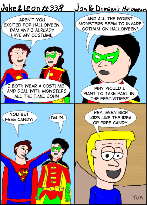
How did panel 3 turn out that bad? And I don’t think I’m pointing out something that isn’t obvious. Superboy’s head is too small. I tried taking advantage of the digital drawing by having a picture of the Super Sons under the drawing. While I realized why this doesn’t work in panel one, panel 3 was done on a different day and I wanted to try again. It really doesn’t look as good as the first one, as if my style was fighting against it. It’s shame to mess up like that since I’m trying to get better, not worse.
But this comic is partly about me testing things out and see how they work. It’s basically art practice and now I know better. That’s how you learn, and panels 1 and 2 came out well enough using the art as a guide, but keeping it off to the side rather than treating it like a rough. I actually tried using the promo model sheet as a rough and that’s where the problems came from. But doing a rough digitally isn’t as easy as when I do it on paper, since I don’t have to use as much control. Maybe there are more settings I need to play with on the tablet, or need to get used to this more, or most likely both.


