That was the prototype image that was filed for copyright. Last week DC fully unveiled the full usage of the new DC Comics logo. Personally I still think it’s bland, much like most of the comic logos in the New 52. There’s none of that flash and style that DC is known for, along with that sigh of hope and looking up to heroes I mentioned yesterday (and Linkara mentions in his Identity Crisis review). However, seeing it in action I have to admit it’s not as bad I as I thought.
Oh, don’t get me wrong. It might grow on me, but it will be more of an acceptance than the endorsement. I still don’t like it. It’s a counterpart of DC’s new style, which may make it fit, but also factors into why I don’t like it. However, let’s see how it will work in practice.
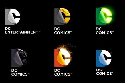
First of all, the logos will each be color-coded to a particular franchise, like so.

The one in the upper left corner seems to be the standard logo. The upper right corner is obviously Green Lantern. I’m not sure about the one in the left corner, the lower middle could be Flash or Firestorm and as you can tell from my theme the one in the lower right would be my favorite. Or as close as we’re going to get to a favorite. The Watchmen one baffles me, though. I know they want to bank on the popularity of the mini-series/collected trade as well as the movie (plus they’re still talking sequel book–for some rea$on)
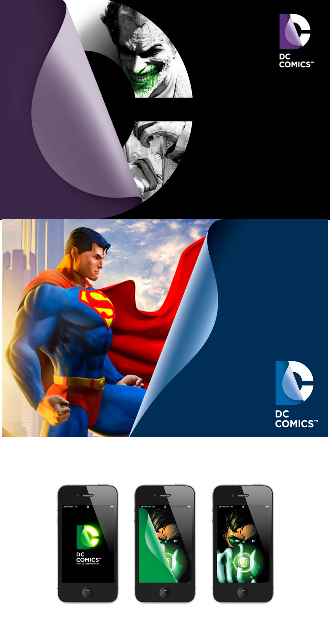
The glowing green and red ones is OK, I guess, but it’s still just a block with D hard to see. The problem is that the logo was mostly designed for interactive usage, from video games and apps (plus possibly the website, ignoring the fact that the more flash (no pun intended) you use on a site the more annoying it becomes) to just the animated stinger at the end of a TV show, movie, or video game. While we don’t have video of this, there are photos.

And you can’t really tell anything, can you? Except that Superman is in his more traditional outfit, but I think they just used the DC Universe Online game promo art for their mock-up. I assume the one at the bottom will be for a smart phone app which gives you some idea about how it will work. Not enough but I don’t think I’d be all that impressed anyway.
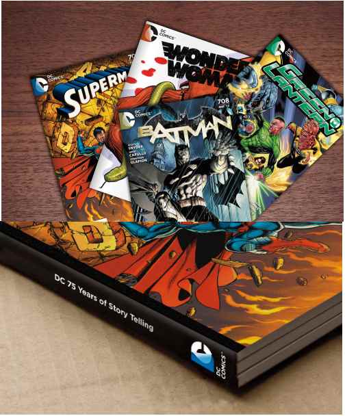
Besides, they still have to add this logo onto their comics. How will that look?

Better that I thought, granted, but still boring. Then again, the Wonder Woman logo, typical of the New 52 (the other three are either too iconic or part of a section that DIDN’T get rebooted) is the one where the new DC logo fits in. Because both are boring as heck. There’s still no style, or at least not the style I look for in a DC comic.
So does it still suck after seeing it in action? Yes. However, they’re at least trying within the style they’ve chosen and maybe my issues with it stem for the new style of the DC Universe starting with Infinite Crisis. I just don’t like it.


