
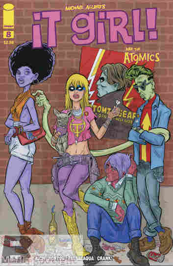
This is the cover they went with? Making It Girl look like a druggie? Or possibly Kate Moss?
It Girl & The Atomics #8
Image Comics (March, 2013)
“The World Is Flat” part 2 WRITER: Jamie S. Rich ARTIST: Mike Norton COLORIST: Allen Passalaqua LETTERS/DESIGN: Crank! COVER ART: Aaron Conley and Mike & Laura Allred EDITORS: Jamie S. Rich & Eric Stephenson SERIES CREATOR: Michael Allred
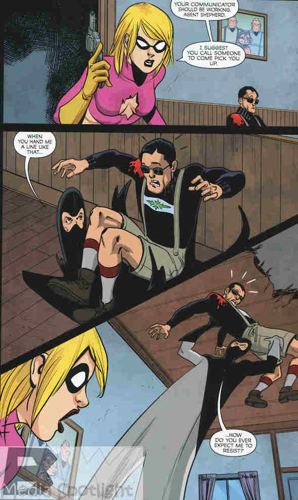
It Girl tries to escape with the professor and his mysterious device, with a little help from her friends.
What they got right: Somehow I’m OK with not really learning what the professor’s device does. You can kind of guess. I do like the villains and I wouldn’t mind seeing them return to give the Atomics grief in the future. As usual both the story and the artwork are fun.
What they got wrong: It’s rare when I call out a cover, but with not much else bad to say about the comic there it is. The series has already annoyed me by having covers that have no connection to the story inside, one of my pet peeves when it comes to covers. They would make for great pin-up art and I can point to a couple of covers that I would like as pin-ups for my little studio were I able to hang anything in this room. But this one is just not up to their usual standards. It Girl looks anorexic and Slug’s human form doesn’t look a lot better. It’s just an ugly cover and they’ve done better in previous issues. Still, I would like for them to try to sell the story inside for a change. Slug, Mr. Gum, and…um…the other guy there aren’t even in this story. Somebody may try to tell me this was an homage to something but it won’t change my opinion of the cover.
Recommendation: Ignore the cover and read the comic inside, because it’s a lot of fun.
Night Runner (cool name by the way) has a point.
Related articles
- Today’s Comic> It Girl & The Atomics #6
- Today’s Comic> It Girl & The Atomics #7
- Preview – It Girl & The Atomics #8 (graphicpolicy.com)
- Mike and Laura Allred’s home ransacked, computers stolen (robot6.comicbookresources.com)


