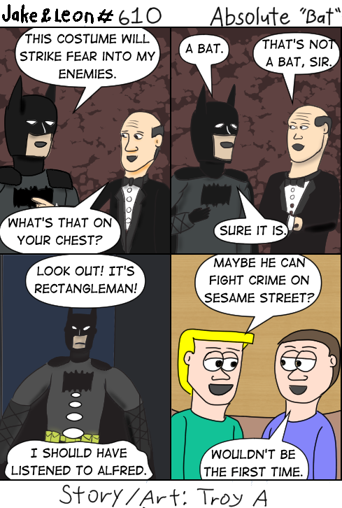
I’m also not impressed with the glove straps.
A recent article by AIPT’s comics side features Scott Snyder discussing his current Absolute Batman series. We’re going to have to agree to disagree on this because the whole Absolute DC imprint is just not for me. It’s a version of the DC multiverse created by Darkseid, so it lacks in the hope department. I’m just not into that. He enjoys making it, fine, and it has its fans, but it’s just not the Batman I want to read. Plus as you can guess from the comic, I don’t care for the logo or the outfit in general.
It’s one portion of this article that I want to focus on. The full title of the article is “The Absolute truth: Scott Snyder on rebuilding Batman and why comics matter more than ever”. (Missing a few capital letters, David Brooke and his editor.) It’s that second part I do agree with him on. As a defender of the monthly comics, I recognize the current problem is that they aren’t written like monthly comics anymore. For some reason both DC and Marvel failed to understand that trade collections only sold because it was a special event or a collection of stories of a particular character, creator, or time period. Such long stories don’t stand out when that’s all you have. Now you’re writing for the trade and at that point you might as well just be writing a graphic novel and releasing it every few months.
That’s not what made comics popular. Those monthly done-in-one stories were a good casual read. You pick one up before you get on the train or have lunch or something. Kids (remember kids?) would pick up an issue a month and have something fun to read before even the superhero stories became to disturbing, but that’s another conversation. Even for adults, the horror, crime, romance, and other genres that cater to older readers were something to pass the time. Soldiers would carry them because they were easy to bring along in their backpacks or get through the rough day of battle or combat training. When continuity came into the comics, it was a reward for picking up the issues each month and allowed a two-part story or the OCCASIONAL big event as well as connect titles of the same publisher together, acting as ads for another comic they publish. You like seeing Superman team-up with the Flash? Maybe you want to check out the Flash’s comic.
So what does Snyder have to say about the monthly comic?
Continue reading →
Tell others about the Spotlight:


BW’s Daily Video> The Tragedy Of Wish
I wasn’t planning to do this many daily videos in one week to a movie I haven’t seen and didn’t care to after the reviews, but it is fascinating just how badly modern Disney screwed up their anniversary movie. This goes more into the history of the original concept for Wish and what could have been.
Catch more from JesterBell on YouTube
Tell others about the Spotlight:
Posted by ShadowWing Tronix on May 21, 2025 in Animation Spotlight, Movie Spotlight and tagged commentary, Disney, Wish.
Leave a comment