It seems I’m bookending the free days with Doctor Who news. On Tuesday, the new logo for Stephen Moffat’s takeover of the series was revealed with a neat little video. That we couldn’t see outside of the UK. Actually, thanks to BBC’s YouTube page, we can!
Reaction has been mixed, but when is that anything new? I’ve decided to take a look at the various logos over the years, since logos are an important part of advertising. Also, as you’ve noticed with certain articles, I like making logos.
So I’m using the “gallery” function again. Click on the logo or scroll through them to see my thoughts on the various Doctor Who logos through the years.
- The William Hartnel Years
- The Patrick Troughton years
- The John Pertwee years
- the Tom Baker years, later reused for Ncuti Gatwa’s opening run
- the US Marvel logo
- the Pinnacle novels
- the Target Books logo
- the Peter Davidson years
- the Colin Baker years
- the Sylvester McCoy years
- the alternate 8th Doctor
- the “official” classics/Paul McGann logo
- Death Comes to Time
- the (old) new series logo
- the Sci-Fi Channel logo
- And finally….
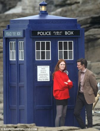
Before I go, I’d like to address one more bit of controversy: the new TARDIS Police Box.

Is Matt drooling over the shiny new Box or the shiny new Companion?
It still looks like it’s made of wood, but the color is a little brighter. Otherwise, what’s the real change? The little brand on the other door? Is that a problem? Seriously? I think it balances out the “emergency phone” door on the door next to it. It’s a nice touch. So far, Moffat is really batting a thousand with me.
logo images from the TARDIS INDEX FILE (aka “The TARDIS Wiki” in this article, because I goofed) and the Doctor Who Logo Collection, except for the Pinnacle Books logo, which I scanned myself, and the homemade logo, althought that should be obvious.)
New TARDIS picture with Matt Smith and Karen Gillian grabbed from the Daily Mail.


[…] Siskoid’s Blog of Geekery took its own look at the theme songs throughout the years as well as the logos of Whos past. (I also did that one here.) […]
LikeLike
[…] produce but for the British Broadcasting Company it would be totally weak. But compare some of the previous logos for the series. That’s the full history of logos that I have seen but let’s focus on […]
LikeLike