
I’m not angry, just disappointed. Honestly if I had a better article topic for tonight I wouldn’t even bother.
Not every superhero has a symbol. Iron Man doesn’t. Wonder Woman doesn’t, not really. I like coming up with symbols for my superheroes because it’s fun but it’s not a requirement unless you’re adapting a logo for a character you’re also adapting. The first Punisher movie lacked the skull on the shirt, while the 2004 one kind of looks like your average t-shirt. It was fine, though, because at least it was there. It’s part of the character’s design and iconography. It’s a question whether a particular character needs a symbol much as asking if a hero needs a cape. In both cases, some heroes really shouldn’t have one. Even I’m not pushing for a Flash with a cape, but not having that lightning bolt would feel wrong somehow.
James Gunn just unveiled the new S-shield he’ll be using for his take on Superman. In the interest of lightening the mood a bit I felt like going over it and why I don’t like it. This isn’t some angry rant and Gunn hasn’t ruined the character forever with his approved design. Zack Snyder’s redesign was the least of his sins when it comes to Kal-El. While I’m still not convince Gunn is a better choice since his issues go in an opposite direction from Snyder and this is the guy who ruined the first live-action Scooby-Doo, the issue with the S is more personal choice than actual rage. Let’s see it first.
The main problem is it doesn’t look like an S. It barely forms the letter if you squint but otherwise it makes you wonder where Lois got “Superman” from. Or Clark himself if you go pre-Crisis with his days as Superboy. One of Gunn’s influences is supposedly Kingdom Come, a story so hyped I’m not even sure I want to read it anymore. I remember when Pacific Rim was so overhyped that I couldn’t get into it when I finally saw it, meaning I enjoyed Uprising more, a sequel that fans of the first movie apparently hate. Plus I don’t want to see Superman giving up on humanity, which is what that S feels to me given that story and the version used in the DCAU for the alternate universe Superman who was tricked into going fascist by Lex Luthor after his Lois died. It bugged me when they used that for the Batman Beyond Superman costume.
The difference between Gunn’s version and Alex Ross’ design for Kingdom Come is that the KC design had black where Gunn’s has yellow, a reverse of my issue with the “flashback” design in Superman And Lois. I think someone said that it might by a Kryptonian glyph, which I assume would mean it’s the family’s symbol, like a royal crest. The “S” shield at one point was the El family crest, then I think it went to the science caste’s symbol, and now it supposedly stands for “hope” because Snyder is terrible in actually demonstrating hope but he knows the word exists.

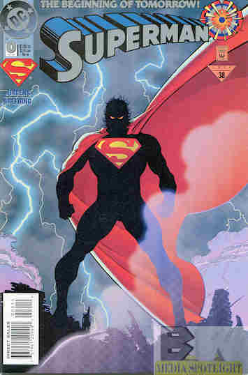
Evolution of the various Superman S symbols, collected by Logopedia and not counting alternate universe designs.
It also kind of remind me of the version Jon Kent uses on his outfit, but even that tries to look like an S without trying to look like his dad’s symbol. At least it has the upper part, while the lower part is just big enough to see the S if you squint. Someone in the comments of the original tweet said the Gunn design more closely resembled a diagonal J or a backslash, and he’s kind of right.
I don’t understand why recent productions have messed with the classic symbol, evolving from a simple triangle (the badge was used on the cover of Action Comics #1 but the triangle is what the story used) to an actual shield to what it is today. The odd shapes started with Superman Returns and Brandon Routh’s costume, but it was a minor alteration. Zack Snyder thickened it and put a line through the S. My Adventures With Superman made the most simplistic version they could despite numerous other animated versions just using the classic design. Now Gunn wants to use a modified Kingdom Come S despite not actually doing a Kingdom Come adaptation, which is probably too early to do. Some fans even think they shouldn’t be bothering a new continuity at all so soon after giving the Sndyerverse a mercy killing…for DC fans, not Snyder fans. I still say give Zack some original characters and let him do what he wants. Worked for Rebel Mo…okay, bad example.
I know the logo is hard to draw. I have to use a cheat in the pencil stage when I put Superman into a Jake & Leon strip. However, this is a live-action production and cartoons before the days of computer assistance had no trouble with it as far back as Filmation and Hanna-Barbera. Any errors were no different than the other art and animation errors over the years. I also don’t know why they stopped putting the shield in full yellow on the back of his cape. I don’t even think the comics do that anymore and I kind of miss it. The cape looks plain without it just like the costume looks plain without the trunks.
In short, while I’m not enraged about this S and it hasn’t ruined my childhood, it doesn’t convince me that Gunn is going to do my favorite superhero any more justice than anyone else over the past few years in any form of media. It may be minor but it doesn’t exactly fill me with any hope. It also doesn’t look like an S that I’d see on Superman, because it doesn’t look like an S.


[…] wasn’t entirely sure I was going to bother revisiting this topic. I said all I needed to about the James Gunn S reveal and how it isn’t an S. Google on my phone recommended me a […]
LikeLike
[…] it looked dirty. Snyder messed with the S shield a bit and it doesn’t quite work, but as we already knew, Gunn is going for a “Kryptonian hieroglyph” idea that isn’t what the S was […]
LikeLike