

I wasn’t entirely sure I was going to bother revisiting this topic. I said all I needed to about the James Gunn S reveal and how it isn’t an S. Google on my phone recommended me a ScreenRant article about how the new design is a good thing, and it’s stupid enough to talk about, but today is the anniversary of Action Comics #1 and taking on this guy in a versus article mostly boils down to “the movies aren’t the source material, stupid!”. Making the claim that Gunn’s non-S is a better example of a Kryptonian hieroglyph is weak when you realise that wasn’t what it originally was, not even being tied to Krypton in the general public until Superman: The Movie, which is one of the many things the movie got wrong even though it’s still the best live-action adaptation even as of the date of this article. Frankly there are dumber ScreenRant articles if the headlines I saw during a search for Superman to find that article on my computer are any indication, and I may even get to some of them when I need a topic. I want to have fun with this day, to celebrate Superman rather than take on one ignorant perspective.
Then I figured out a fun way to do both.
Why not take the time to celebrate Superman through the S shield and go over what it used to mean versus what it is now. For one thing, as you can see by the above image, Superman didn’t even start out with the logo as we know it today. The Logopedia image collecting the logos didn’t even go over the numerous variants over the years, just the primary ones. Therefore, it might be interesting to go over Superman’s symbol. A symbol on a character or organization in fiction is an important piece of iconography. I even knew that instinctively in middle school when I started creating heroes. See a symbol and you know what franchise it comes from and what character is attached to it. You can tell from the rough robot face who is an Autobot and who is a Decepticon, or which flavor of Maximal or Predacon you’re dealing with. There’s a reason the US Space Force logo was accused of resembling the Star Trek logo and why some people did or didn’t like it. Even that logo started out as exclusive to the USS Enterprise until someone messed up for the first Star Trek movie onward.
It’s true in the real world as well. I have a BW logo and a personal “ShadowWing” logo. YouTube channels have an image that tells you right off what channel your on. Most organizations and businesses have a symbol that identifies their club, item, or medical care. Street signs and bathrooms both use symbols for the reading impaired or anyone who doesn’t read English (or doesn’t have time at 60 mph). Symbols are important, and Superman’s has evolved over the years visually, but to understand the origin is to understand the character. So let’s learn about Superman through the history of the S.

If you look closely at the cover of Action Comics #1…the original Action Comics #1 before DC went relaunch happy…you’ll notice the S is just a normal S in a sort of shield. It’s kind of reminiscent of a police officer’s badge, as seen in the Logopedia image I opened the article with. It also means Superman is here to protect you, as his body is bulletproof. Or rather back then, anything less then the force of a bursting shell from a cannon could pierce his skin due to his advanced Kryptonian biology. (The whole sunlight thing came later.) In the actual pages of the comic and from then on the S was different.
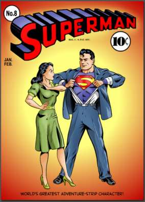
This image is taken from the crossover with War Of The Worlds due to the Orson Wells play coming out the same year. Though the comic would use the original HG Wells designs for the aliens with a nod or two to the radio drama and first movie, this is the symbol kids who grew up alongside the comic debut would recognize. And it didn’t come from Krypton. It’s an S. Jerry Siegel and Joe Shuster wanted to call him Superman. Krypton would be something Clark didn’t learn about until they got closer to the Silver Age, but only because Siegel and Shuster’s alleged original plan for Superman #8 was rejected. This is the eighth issue of Superman’s self-titled solo comic after numerous adventures in Action Comics, where there was also no Jon and Martha Kent. I don’t think they ever explained what happened to baby Kal-El’s rocket until the Kents were retroactively added in Superman #1, which was also their last appearance until the Superboy years were retconned in during the Silver Age because some at National Comics, DC’s previous name, saw a new way to make more Superman comics and make more money.

Here is an image of Superman from Superman #8…
…and the alternate cover from the rejected story I mentioned earlier, though I don’t know if this is a recent artist concept or taken from the same already drawn pages from the rejected comic. (Yes, Jerry Shuster had already drawn a bunch of pages and Shuster scripted out the whole thing.) This is when we get closer to Superman’s more familiar design. Going back to the above chart, the S design had undergone a few designs over those years. The S started to merge with the triangle. One of those went with a more traditional shield, less police badge and more “kite shield”, one of the types of shields one thinks of when they think of a shield. Unless you’re Captain America, though he started with a similar shield on his arm.
It wasn’t until the 1950s that we see the logo we know and love in it’s primary shape. Tweaks usually come from the artist’s hand diverting as artists do. As someone who has tried to draw that logo many times over the years, I know how hard it is.

Apparently they can.
I had to start cheating by using an actual shot of the logo inserted into my digital pencils so the final digital inks were still my drawing. For a drawing on paper that’s not an option.
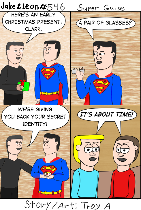
It’s also a gift for the fans. I expect DC to return it as soon as possible.
Now if we could just solve my other issues drawing Superman. Geez, what was with all the flat heads in this one?
Back on topic. Superman’s S has also been altered situationally. I don’t have an image of it from Kingdom Come and I haven’t fully read it, but from what I can tell it’s Superman turning his back on a world that supposedly turned his back on him and his ideals. I hate this idea because Superman doesn’t do what he does for the praise. He does it because its the right thing to do, but maybe it works better in the story. There are worse alterations, and they usually come with the worst aspects of messing with Superman.

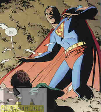
This also resembles what James Gunn is going through, and it should have never been used by Batman Beyond. It comes from the Superman: The Animated Series episode “Brave New Metropolis”. It’s one of those dumb stories that thinks something happening to Lois will drive Superman into a fascist state, though unlike the Injustice universe he comes to realise it was a trick by Luthor to use him to take full control of Metropolis. It’s undone when the regular DCAU Lois gets sent to that universe and reminds Superman what kind of person he’s supposed to be. How Superman ended up with that symbol in Batman Beyond is confusing. I don’t recall evidence that it was Starro’s doing as nobody seemed to mention the S change.

Then of course you have the “electric Superman” period, where DC thought messing with Superman’s power set would refresh the character. It was pretty much rejected by everyone and is still a bad idea. The logo still has some of the classic symbol to it, but with an electric twist. Still better off without it.
So where this whole “Kryptonian symbol” thing come from? Blame Richard Donner. Look, I admitted earlier that Superman: The Movie may be the best live-action depiction of Superman out there, but it has a bunch of bonehead decisions that really aren’t acknowledged. One of them is Donner having Jor-El bearing the symbol when addressing the Kryptonian counsel. Before then it was just something Clark, or in some versions Clark and his Earth dad, came up with. That’s how the comics addressed it. It didn’t need to have some special tie to Krypton, a world he mostly knows from the super enhanced memories of a baby and a bunch of data recordings on his old ship. In the comics, Jor-El had a sun inspired symbol on his outfit, not the S. It really was just an S for Superman. It didn’t need to be more than that and nobody cared. Smallville would continue this by having evil virtual ghost Jor-El (one of the things that turned me off to the show) also use it as his symbol as well as a Kryptonian symbol looking like a mirrored variant. I’d look it up, but it’s Smallville and like I just said, I lost interest in their Supermanless Clark.
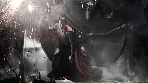
Then you have Zac Snyder’s Supermanless Superman. I still say Man Of Steel was a good superhero story but a terrible Superman adaptation, and the S is one of them. For one is it a huge redesign, even more than Superman Returns, which wasn’t bad, but still not the James Gunn/Brave New Superman/Kingdom Come inspired version so points there. However, he also couldn’t let an S be an S, though he did make Jonathan an ass. Go back and watch that movie and the name “Superman” doesn’t even come up, though it does get interrupted at least twice, like the movie was afraid to let him use it. Par for the course with a movie that seemed to be pushing against Clark’s destiny even more than Smallville did because at least that Clark got to use his powers to help people and the universe called it a good thing.
No, the “S” isn’t an “S”. It stands for hope, something Snyder was terrible at demonstrating by Superman’s actions, outfit design, or anything else that looked like Superman being a symbol of hope. Again, that’s what the movies added and also again the movies are not the source material, the comics are! Because of the movies and shows (I didn’t even waste time watching Sci-Fi’s Krypton series, but it showed up in the trailers), the comics would declare it a symbol of the science caste or the “coat of arms” style symbol for the House Of El or something, but until then it wasn’t supposed to be Kryptonian. It was there because a plain chest didn’t have the look Clark was going for, and Jonathan came up with what we know today.

Jon, Clark’s son, trying to create his own S is fine with me because it’s not meant to be anything more than Superman’s symbol. Jon wanted to be his own Superman (good luck with these creators) and I’m not against that…though I think now he actually does just use dad’s symbol.
This is what I’ve talked about with other properties recently. They can’t just let a normal thing be a normal thing in an extraordinary reality. The S has to be more than an S, so it becomes a connection to a planet he lived on for a few months before going into space. It can’t tie him to Earth. Everything needs this big epic exposition reason for existing because they can’t let something just be what it is. They tried to explain why Jimmy Olsen wears a bowtie and why Wolverine in the movies wears a jacket, two things nobody asked about because we just assumed Jimmy liked bowties and Logan bought a jacket he really liked while riding his motorcycle. Sometimes an S is just a letter.
I’m okay with that. Superman is my favorite superhero. His outfit was inspired by circus strongmen and the symbol give it a visual flair as well as an iconic design that is immediately recognized as Superman. Happy anniversary, Superman. And to you as well, Lois. I haven’t forgotten you debuted in the same comic.


[…] isn’t what the S was originally. However, despite what one writer tried to claim last week and I had to counter, resembling an S instead of a backwards L is what led to him being called “Superman” in […]
LikeLike