

Totally Doctor Who (Photo credit: Wikipedia)
I think every showrunner is going to come up with his or her own Doctor Who logo, which I guess is them putting their own stamp on the show immediately. Of course the new Doctor is going to be a woman (and I listed my problems with that before Capaldi was announced and I’m sure I’ll be accused of being a dirty sexist who won’t give Jodie Wittaker a chance, even though I plan to) but that has nothing to do with the logo change. Incoming showrunner Chris Chibnall and the BBC have revealed their new logo for the beginning of his run, and this I’m not giving any quarter. I don’t like it.
The video itself is okay, but the logo is what I’m focusing on and…it’s rather plain isn’t it? There is some attempt at styling it, so it’s not as bad as it could be. It doesn’t necessarily look like someone slapped a font from Blambot on there and called it a day, which makes sense for a low-budget product like I would produce but for the British Broadcasting Company it would be totally weak. But compare some of the previous logos for the series. That’s the full history of logos that I have seen but let’s focus on the last two New Who logos.

the (old) new series logo
This is the one from Russel T. Davies and whatever problems I had with his run (he gave us Rose Tyler and showed his hatred of Christmas for starters) The variations of this log still looks pretty cool. While the lettering is still kind of basic the “plate” it’s on still has more design to it than stabbing the lettering with a few lines.
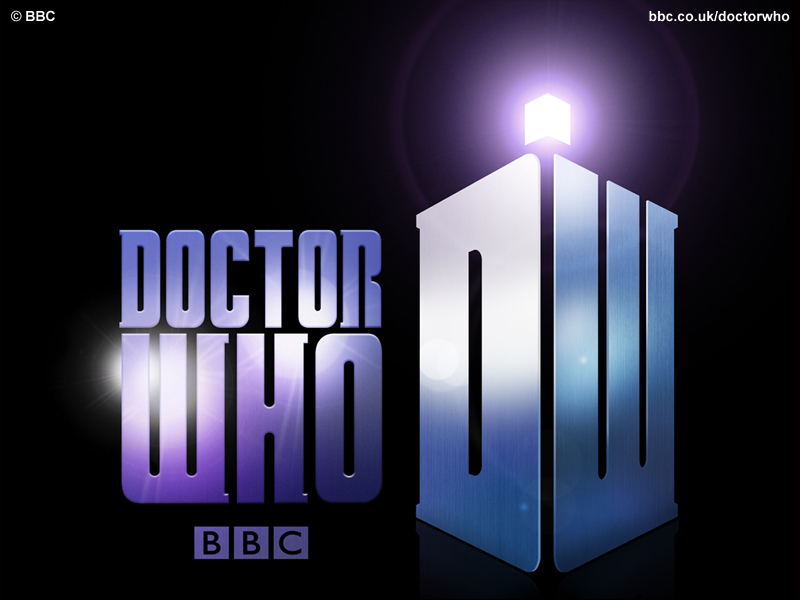
And finally….
Admittedly this one had to grow on me a bit but it seems like simple stylized lettering is all you can hope for from the New Who logo makers. The DW forming a police box was nice but it lacks the flash of the old Who logos.

The one we’re going out on is a little better in that it looks like it’s hand designed or at least designed on a computer. However, compared to some of my favorite old logos none of these hold up.

the Tom Baker years

the Sylvester McCoy years

Death Comes to Time, a story I don’t care for but the logo was neat

the alternate 8th Doctor
Okay, I’m rather biased about that last one…I made it for a comic I did with my friend Sean before the TV movie and I still agree it isn’t that great. Maybe with some work? Maybe not. I can do better. Point is those all have more substance than any of the New Who logos because it looks like a lot more effort was placed into them, even mine. There’s style (you many not care for the style but it’s there), a bit of flash, and just feels more like you’re about to drift through time and space on a strange journey, or at least it does to me.
But what I really want to see is the new TARDIS console room, because I’m sure there will be one. It seems like all of the flash and style goes into those and I’ve had mixed feelings on the last two. There were things I really liked and things I didn’t, although I admit my bias towards the classic room. Which has nothing to do with my disinterest in the Davies “coral” motif because that thing was just ugly compared to any of the other console rooms. And I’m including the out-of-continuity Peter Cushing TARDISes in that list!
But what do you guys think? Is the new logo okay or lacking something?


I forgot about your alternate 8th Doctor logo. That’s actually pretty decent. Very clever in how the question mark is part of the logo. As fellow students at our old high school used to ask us: Doctor Who? Who’s the Doctor? The BBC should have bought your logo from you, Tronix! The 4th Doctor’s logo will always be my favorite because that was the first Doctor Who logo I ever saw because Tom Baker’s Doctor was the first Doctor Who shows that I saw on our state public television station back in the 1980s. In recent times, I only got to watch one Capaldi show. It was the one where the Doctor lands in Scotland in the time period when the native Picts were fighting back against the Romans (I viewed this around Christmas time when I was visiting my parents). I was impressed with the show and liked how it was set in a historical time period on Earth. Jodie Whittaker will surely do a great job as the first female form of the Doctor. Hey, Doctor Who is all about changes, as we’ve seen the Doctor looks so many different ways over the past 50 plus years! Us Doctor Who fans are used to change….it’s a constant in the world of the Doctor.
LikeLike